McFam’s old logos and such
June 1st, 2009 by Steve · 3 Comments ·
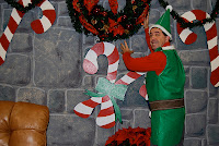
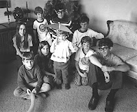
Remember when McClellandFamily.com looked like this?

I had several different versions of this header and the photo would change based on where your mouse was on the page. I thought I was pretty slick. In retrospect, it was a clean interface that tied in well with the theme I was using. Small colored blocks would appear behind the different menu items as you moused over them too. It was a lot of work for such a small readership. Back then I had three to five unique visitors a month. While my uniques now number 75 or so family, friends and drop-ins, McClellandFamily.com has always been about forcing me to try new design techniques on the interwebs and about getting a little family history into the books in the process.
Here are the other versions of the header:


This one’s a McClelland Family (Clan) crest that I used on the front page for a short while until someone pointed out what it depicted. Racial undertones aside, it actually shows a hand holding a sword with a moor’s head, and it does, after all also depict the family motto, “Think On”.

Perhaps this one would have been better to use:

It’s interesting to note that I originally thought this site would be a family history and genealogy site, perhaps with forums and a message board. I quickly realized that you can’t compete with sites such as geneaolgy.com or geni.com, and McClellandFamily.com morphed into what you see today. You can still find traces of my early beginnings if you look hard enough.
You can get all the stories about Emily in one place, but back in the day this young lady had her very own page. While honing my Photoshop skills, I spent a great deal of time creating a dazzling animated .gif of “Emily’s Corner” as was fashionable in the early 90’s. Now it just makes me nauseous.

However, it was a vast improvement from the hand drawn look of the early McClellandfamily.com site.

Here are the original navigation menus. The red target-looking thing would appear as you moused over each menu item. And each one of them is a unique graphic. Nice.


Patrick’s first little slice of the internet came complete with his own logo too, but second child means much less time in the creation of said logo:

It was a static page complete with photos, stories and even video. It took a ton of time to update it though, so along came the blog.
I thought I was giving Google a run for it’s money in the early 90’s, creating a custom logo for special days of the year, so I’ve got tons more old logos still to share, but we’ll save them for another post.


3 Comment so far ↓
1 Unarchiving more archives on Nov 12, 2010 at 6:37 pm
[…] here on the new and improved blog. (They were originally posted in that sappy old blog with that racist logo.) Rather than leaving them there to perish or simply bringing them forward to this blog and filing […]
2 Dusting off the archives makes them easier to read on Dec 10, 2010 at 11:21 pm
[…] McFam’s Old Logos and Such: A few old logos that we found were added including this racist version of the McClelland family crest and my dazzling animated gif for Emily’s Corner. Originally published June 1, 2009. Les is Still Younger Than Dirt!: Family and friends help Lisa’s father Les celebrate his 75th birthday. Originally posted April 28, 2005 Tom’s Thoughts on Crystal Adventure Tours at Ports of Call: One that I put together (Newsboy, Tom wrote it) and then never published! I believe I was waiting for some photos from this supposed Newsboy. I never got them so I’ll publish it now without them. Originally written April 29, 2009. […]
3 Preserving old website headers on Jan 10, 2014 at 8:36 pm
[…] promised back in 2009 that I would dig up some old masthead versions that were used for quite some time on the original […]
Leave a Comment